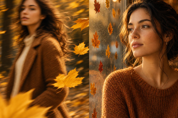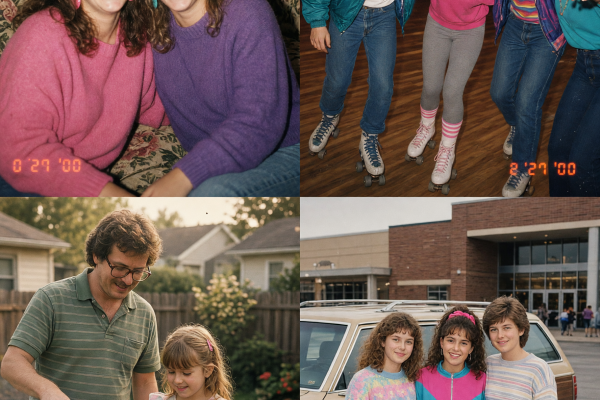

The postcard photo effect turns a new trip photo into something that feels picked up at a flea market. Think faded ink, slightly warm film color, a soft paper surface, and just enough wear around the edges. It works because the picture still feels like a real moment, not a costume party for your camera roll.
Start with a photo that says where you are without a caption. A scooter near the sea, a bright hotel sign, wet pavement, a train window, or a friend carrying a map all give the edit something to work with. Then add the vintage cues with restraint. The best result looks found in a drawer, not buried under ten filters.
How to build the postcard photo effect
Pick one clear subject first. A postcard needs an instant focal point, so crop out visual clutter before making the edit. Leave room for the location behind the subject. A wide shot can work, but a person or object near the lower third usually makes the image feel more like a travel keepsake.
Use a prompt that names the place, the light, and the print finish. Try: Turn this travel photo into a 1970s seaside postcard, faded cyan sky, warm sun-bleached colors, subtle paper grain, light ink wear at the corners, natural face detail, no text. If your first version looks too yellow, ask for neutral whites and restrained warmth. If it looks too clean, add soft halftone dots or lightly worn pigment, not heavy scratches.
Keep the photo readable on a phone. Texture belongs in the background and outer edges. Faces, signs, and the main travel detail should stay sharp. That contrast makes the effect feel printed rather than blurry.
1. Sunny coastal card
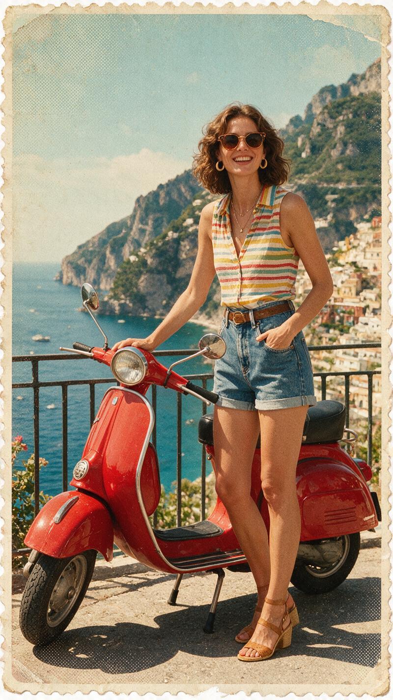
A scooter, bike, or little rental car gives a coastal picture motion before the edit even begins. Shoot from slightly behind the vehicle or keep it off-center so the road and water lead through the frame. Midday sun is fine here. The postcard treatment can soften hard light and turn it into that washed-out holiday color.
For this look, try: Vintage Mediterranean travel postcard from a candid scooter photo, pale turquoise water, cream road dust, faded red accents, 35mm film softness, subtle postcard paper texture, clean subject, no lettering. Keep one bright accent, such as a helmet, swimsuit, or umbrella. It stops the soft palette from turning muddy.
Use it for a trip recap cover, a summer carousel opener, or a saved highlight image. If the edit will become a video, begin with the finished card filling the screen, then let the paper frame lift away to reveal a two-second clip from the ride.
2. Colorful street card
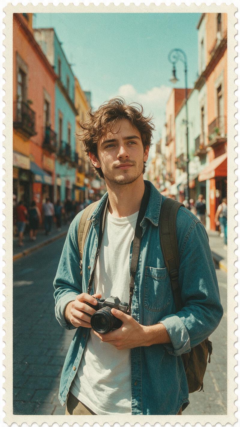
Colorful streets already have the graphic shapes a postcard needs. Look for painted shutters, tiled walls, striped awnings, or market fruit. Take the photo when the street still has a little shadow. Flat noon light can erase the depth that makes old-print color appealing.
Try this prompt: Transform this city street photo into a printed travel postcard from the late 1960s, faded coral and teal inks, gentle grain, slightly imperfect registration, soft cream paper border, realistic people and architecture, no text. “Imperfect registration” can create the tiny offset between colors seen in older prints. Ask for it softly. Too much makes buildings look doubled.
For a more personal result, leave one modern item untouched: your camera, tote bag, or a takeaway cup. That little clash makes the image feel like a current trip remembered in an old format. It also works well as a location slide between talking clips in a travel reel.
3. Friends in transit
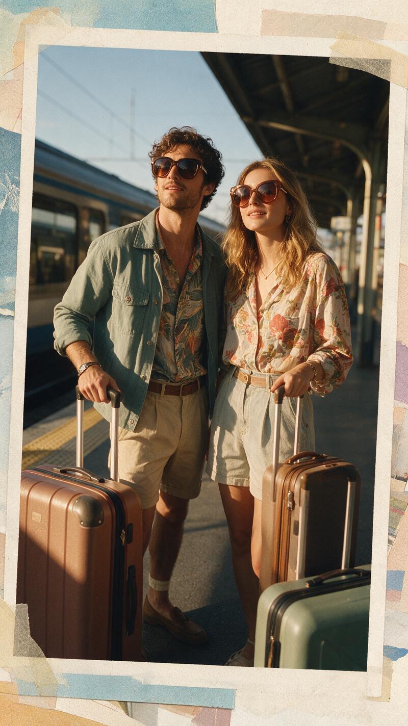
Train platforms, ferry decks, and airport windows are full of travel feeling. The trick is to catch a small action instead of lining everybody up. Someone looking for a ticket or laughing at a bag makes a stronger memory than a perfect group pose.
Use: Make this candid friends travel photo look like a well-kept vintage postcard, warm late-afternoon film, matte paper grain, lightly faded edges, true faces, natural clothing detail, documentary snapshot feeling, no text. “True faces” and “natural clothing detail” help keep the people recognizable while the finish changes around them.
Choose a horizontal crop when the platform, route map, or view outside the window matters. Choose vertical if the people are the whole story. This version suits farewell posts, friend-trip albums, and a reel cover that needs to feel warm without looking overly posed.
4. Rainy city card
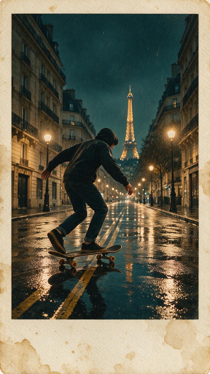
Postcards do not need blue skies. Rain gives pavement reflections, umbrellas, and a moody color palette that feels like a treasured off-season find. Keep one thing crisp: a skater, umbrella, tram, or walking figure. Let the reflections do the rest.
Try: Rainy European city scene printed as an old travel postcard, muted navy and brick red, reflective pavement, gentle film grain, soft paper texture, lightly faded edges, sharp moving subject, no text. Avoid asking for lots of damage. A few pale corners and quiet grain make the atmosphere; torn edges can distract from the wet street.
This look is a good fit for a weekend-city recap, a playlist cover, or a before-and-after post. Pair the final image with the original in the next slide. The contrast makes the production choice obvious and gives viewers a reason to save the prompt.
Make the edit feel found, not filtered
Before exporting, check four things. First, the location should still be easy to read. Second, skin tones should look human. Third, texture should not cover the focal point. Last, leave any postcard-style wording out unless you need it for a design. Generated lettering can pull attention away from the photo, while a simple caption added later gives you more control.
A current image-generation model can help shape a detailed print finish from a written prompt or a reference image. Keep the instruction specific, then change one production choice at a time: warmth, grain, border, or ink wear. That makes it easier to spot what actually improves the image.
For another save-worthy edit, browse these trending effects.
Try this effect in Bloom AI
Recreate these looks on your own photos and videos – free to start.
For a practical guide to describing the subject, style, and lighting, see Adobe Firefly’s prompt-writing guide.